Monday, 1 March 2010

What i am basing my website on??

what makes a good logo??
A good logo is something that is eye catching and it makes the reader look at it or want to find out more information about. It needs to have a clear message about what it is advertising, it can be mysterious but it has to show what it is about.
There is five key points to a logo that you need they are;
  • It’s describable
  • It’s memorable
  • It’s effective without colour
  • It’s scalable i.e. works when just an inch in size
  • It’s relevant to the industry in question

This is a good use of making shapes with the logo because it has used the H as a home and it looks effective and simple.


Monday, 22 February 2010

Charity Logos

I have looked at different charities and their logos and i wanted to look at the design of the website and the use of there logo to emphasize the importantance of the charitie.

The cancer research UK is a very simple logo but it is very affective and know everywhere for its logo. It is in an arrow shape to represent the way forward to move on and aim to get rid of it. The red dot at the end makes people think about what it is, it could represent;
-The one cell is infected within the body.
- That one person has it and all these people are helping them and are here to help.
- It could also mean there is an ending point for it.


This logo is simple but affective, it a bible referance to the good samaritan, who helped the man so it resembles that with helping and caring. The boldness of the logo and the light, bright colour makes it seem happier.
This logo is fun and and exciting and it is exact to the point the little red man represents running and thats linked to sport. It is simple but very effective the ball (head of the man) is showing a ball of some sort.
I have decided to do a logo which is linked to animals so i did a paw shape logo. This resembles that it has something to do with animals. It is a simple logo but effective which shows that it it can advertise the charity.

Below is my dafts of my designs;


This is my final attempt at designs;


I have two designs of the logo but i decided that this design looked better as yellow and brown work well together and from my research on colours and they are complimentary and complement each other well.


This was my other design but i thought that the orange/yellow of the text didnt work very well and i thought that the other logo was better.

Monday, 1 February 2010

Preliminary task - My website


Evalution of the website
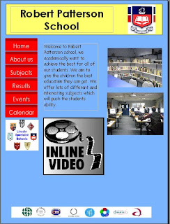
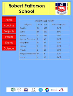
I would have to make my own logo instead of getting one off the internet already existing, could use colours that work better together. I made my own video which makes the page more interactive and would interest the reader into the website more. I also put on the schools awards that they have won along the bottom i have kept this on each page because it emphasizes that the school wins awards. On the about us page i have used a map off google, to improve this i could make my own map of the school so i am not copying other peoples work. i have used some of my own pictures of a school which makes it better because it is my own work. i think that the layout of the website is simple but it is effective, on some pages there is too much information and on others there is not enough information.

Monday, 14 December 2009

Monday, 2 November 2009

Preliminary task - Storyboard

This is my storyboard which is where it shows my design of my website, how i want to design it and adapt it to what i want. Next I will be choosing my colour of the website.

Monday, 19 October 2009

Preliminary task - website choices

What is the websites purpose?
The purpose of the website is to inform both the students and the parents about the school and to advertise the school. This will show to current students and prospective students who are wishing to attend the school. the website also contains key dates and events that are held within the school.

Who are the audience of the website?
The audience to the website would be current students, new students looking at the school, also parents of both students attending and prospective students. Teachers would use it to advertise their subjects and promote for GCSE and A level, teachers that are wishing to transfer can also use the website to see the achievements within their subjects etc.

What does the website have to communicate?
The website has to advertise the school in its best possible way. It needs to show that the school is friendly, healthy, academically strong and opportunities for the children. It needs to show why children should choose their school to go to over other schools, it also needs to have a a sense of fun within the school. A want to learn and aim fo the best.

What will the personality of the website be?
The personality with have both informal and formal parts to it, the layout should be clear and easy to read and understand. It needs be written in proper english instead of shorting the words because it has a massive readership from parents to teenagers. But it also has to be relaxed and positive towards the school, so it is advertising the school. It needs to attract both parents and students to the school.

Monday, 21 September 2009

Preliminary Task: Web designs and Convention

What is a convention??
A convention is a set of guidelines and informal rules to follow, but they do not have to be followed. They can be broken to catch someones eye or to stand out in a group. conventions are neeeded because it gives you something to follow and it helps to make it is easier to use. For example in a website you will always have a toolbar so that the user can easily use the website.

Why are they useful??
They are useful to help the user understand how to use the e.g. website. Especially if your target age group is for a young age group, it will have to be simple and easy to use. It makes sure that most of them follow the guidelines so if it was in a different lanuage the user would still beable to understand where everything is.

Do we have to use them all the time??
We dont have to use them all the time, if you dont use it, it will stand out and be more eye catching. If we use them all the time then we will have no individuality, and everything will be the same and it will make it boring and very samey.


An example of a website that breaks convention is this dance group ;

This still works as a good design it is eye catching and it captures the idea of dancing through the layout on the website.