Friday, 4 June 2010
Tuesday, 4 May 2010
video
This is the video that is on my website, I used both still pictures and I got some film which I recorded and edited myself. I have used the software that comes with the computor the Windows moviemaker to produce my video. I have used both still and moving becuase I think the contrast to the consumer from moving to the still so makes it more eye catching. I have added writing with in the video becuase it think that me explaining what the website was about makes every consumer understand what the website is about. I believe my video represents all the types of animal and that they deserve a kind and caring home.
That was my first video I did I got feedback from my friends on it and they told me I had to have the pictures showing for longer now they show for 3 seconds. Also they told me that I spelt calmer wrong so I changed it and improved it so that it looks better.
Friday, 30 April 2010
Final website & draft designs
I used web plus 10 to design my website this is a software that can help you make websites, I designed my own navigation bar by using photoshop this is where i was able to distort my the writing so when you hover over it it will look like the writing is highlighted.
This is my navigation bar I constructed it with Photoshop, and then did a copy which can make it flash.
i used photoshop to cut my photos to make them more appealing to the reader and also it makes the picture look better. I used all shapes circles, rectangle, oval and pentagon.
I made my logo easily out of shapes on photoshop then I simply added the writing to the shapes and coloured it in. i had to simpify the layer so i could change the colour of the shape.
This is my basic design of te website I usd photoshop to produce the curve in the orange shape to make it look more effective and it sort of breaks the conventions of a website.
Next i added on the paws down the right hand side to represent that it is about animals and to make the website stand out more.
Draft designs
My website has changed from the original designs because i got new ideas and changed it as I was working like the layout of the website and the format.
This is my homepage of my website;
This is my home page on this page i have two original images and a video clip which i made, i tried to have the video look better but due to the programme I was unnable to do so.
My donation page;
On my donation page I have four orginal images and i also have a hyperlink on to another page for more information.
Our work in action page
On this page I have two orginal imaes and I have used my own writing to make two stories about the animals and what happened to them.
About the animals page
On here I have five hyperlinks to other pages and I also have one orginal image on this page. On all the pages i have a working navigation bar where i link up with going to ther pages i used the heading of the name as the anchor for each page.
Sunday, 18 April 2010
Photography, Composition and Non verbal communication
Eye flow
This is a techniquie so the viewer can see all the picture, it makes the viewers eye travel along with the photgragh so they see the whole picture. Every bit in the picture takes you on to another bit so it taking you on a journey through the picture.
Dominant element
This is where there is one main object/person in the picture and that object/person is the focus of the picture. It is usually the centre of the picture and the main focus.
Simplicity
This is used to single out a item or items, they only use what is essential for the image to look good enough.
Balance
The balance within a picture is key for its outcome, is it symmetric or asymmetric, subtle or obvious.
Diagonal rule
One side of the picture is divided into two, and then each half is divided into three parts. The adjacent side is divided so that the lines join together the resulting points form a diagonal frame.
The rule of thirds
The Rule of Thirds is based on the fact that the human eye is naturally drawn to a point about two-thirds up a page. Crop your photo so that the main subjects are located around one of the intersection points rather than in the center of the image:
The picture above is almost dead in the middle of the picture so there is wasted sides round the outside of it. This makes it uninteresting so I believe that I need to change it to make it more interesting. I can use the line of three grid to crop the picture so the wasted space is not there anymore. If crop the picture the flower will be off centre which makes the picture more interesting and mysterious, and makes the flower the main attention of the picture. Below is a different picture where the flower is from a different angle.
I cropped this picture which makes it look more interesting the line of three is where u divide the frame in to thirds, the points of the grid where the subject should be placed in order to be most interesting . The middle of the flower is directly lined up with the focusing points. Any one of those four points is a great place to frame your subject.
Non verbal comminication
Expression - this is cultural codes that are instictly recognised when you see it.
Eye contact - directly looking at the or towards the consumer or involved within the scene of the advert.
Clothes - These are important to show to the audience and it potrays what the person is like.
Pose-static or active - It works with emotion and this can also be symbolic of a status.
Body movement - This relates to the way the person is moving
Positional communication- This is the relationship between the actors in the frame of the picture this resembles where they are enermies or friends depending on how they are placed within the picture. Also status can be shown.
Reciprocal - This is a way of showing a relationship where the two people are in each others attention
Divergent -Each persons attention is diverted away from each other showing a relationship that they dont get on well.
Object - The people have their focus on a certain object which is the centre of the photo.
Semi-reciprocal- One of the people within the picture their attention is concentrated on the other, whose attention is elsewhere.
Monday, 22 March 2010
Colours
I think I will use orange, blue and white for the text so it will stand out. Blue can represent freedom to the audience and it makes you want to help the animals. The orange stands out and contrasts againist the dark of the blue.
Monday, 1 March 2010
What i am basing my website on??
A good logo is something that is eye catching and it makes the reader look at it or want to find out more information about. It needs to have a clear message about what it is advertising, it can be mysterious but it has to show what it is about.
There is five key points to a logo that you need they are;
- It’s describable
- It’s memorable
- It’s effective without colour
- It’s scalable i.e. works when just an inch in size
- It’s relevant to the industry in question
Monday, 22 February 2010
Charity Logos
 This logo is simple but affective, it a bible referance to the good samaritan, who helped the man so it resembles that with helping and caring. The boldness of the logo and the light, bright colour makes it seem happier.
I have two designs of the logo but i decided that this design looked better as yellow and brown work well together and from my research on colours and they are complimentary and complement each other well.
Monday, 1 February 2010
Preliminary task - My website


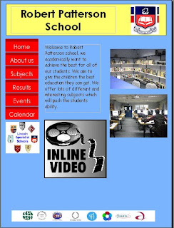
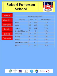
I would have to make my own logo instead of getting one off the internet already existing, could use colours that work better together. I made my own video which makes the page more interactive and would interest the reader into the website more. I also put on the schools awards that they have won along the bottom i have kept this on each page because it emphasizes that the school wins awards. On the about us page i have used a map off google, to improve this i could make my own map of the school so i am not copying other peoples work. i have used some of my own pictures of a school which makes it better because it is my own work. i think that the layout of the website is simple but it is effective, on some pages there is too much information and on others there is not enough information.


